Case Study 2: Responsive Website
case study
Project Overview
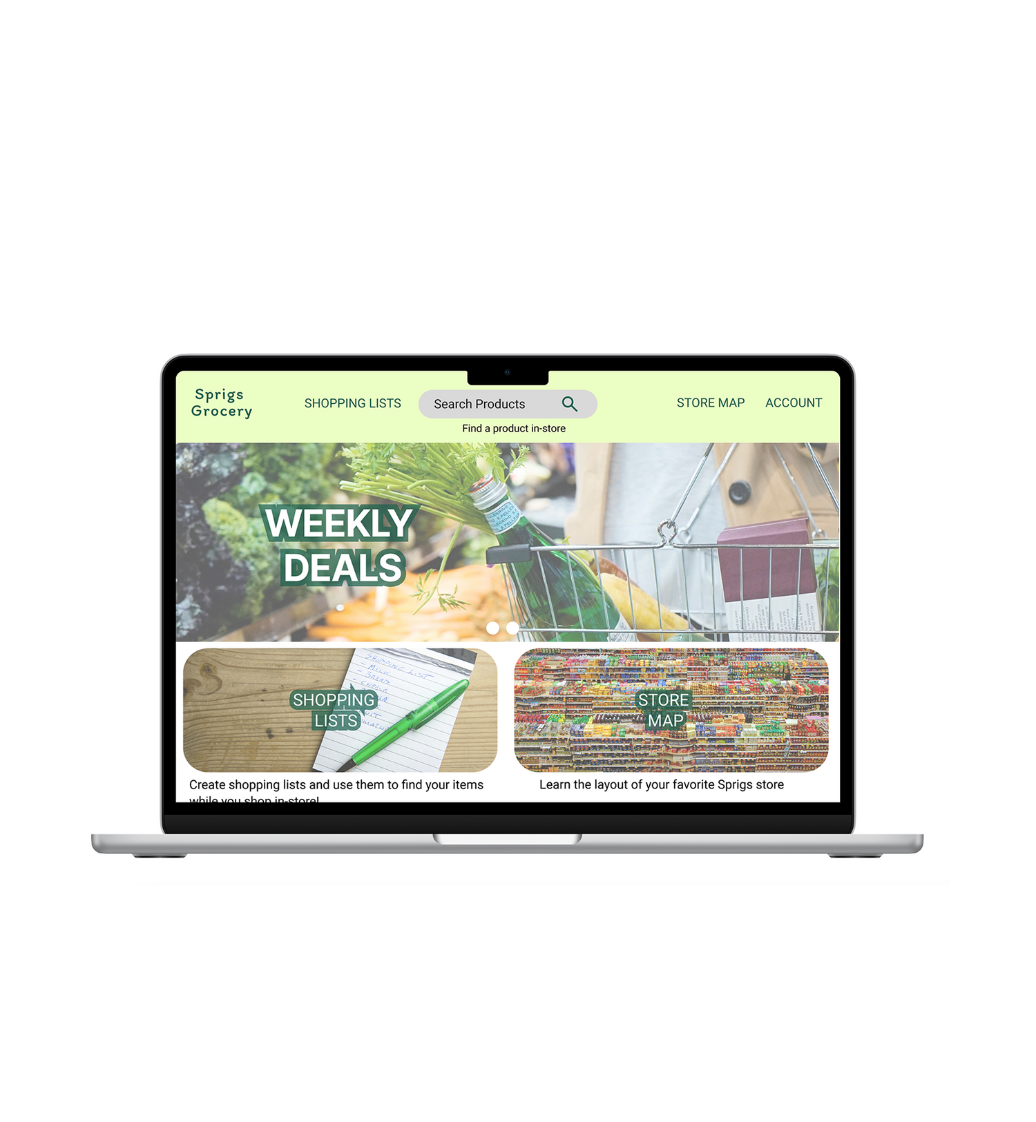
The product: Sprigs grocery is a grocery store focused on healthy affordable choices and has multiple locations. The Sprigs grocery website is a complement to the app that helps grocery shoppers find items quickly and easily while shopping in person. The typical user is 30+ and is a working professional and/or parent.
Project duration: March - April 2025
Role: UX Designer, Researcher
Responsibilities:
- Define problems, user personas, user journeys, empathy maps, user flows
- Conduct user research
- Design paper and digital wireframes, mockups, low and high-fidelity prototyping and user testing
- Design for end user and accessibility
User Research Summary

Understanding the User
Persona: Becky
After initial user research I created 3 personas. Here is one example:
Problem statement:
Becky is a busy mom who needs to grocery shop in-store efficiently because she has limited free time.
Goals:
To grocery ship quickly, stay on budget, feed her family mostly home-cooked meals that are easy and healthy. Stick to a pre-planned grocery list.
Frustrations:
Shopping in-store can be time-consuming. Not being able to find an item or it being out of stock when getting to the store.
Starting the Design
-

Starting the Design
After understanding the users, I created a hierarchical site structure to layout the organization of the site

starting the design
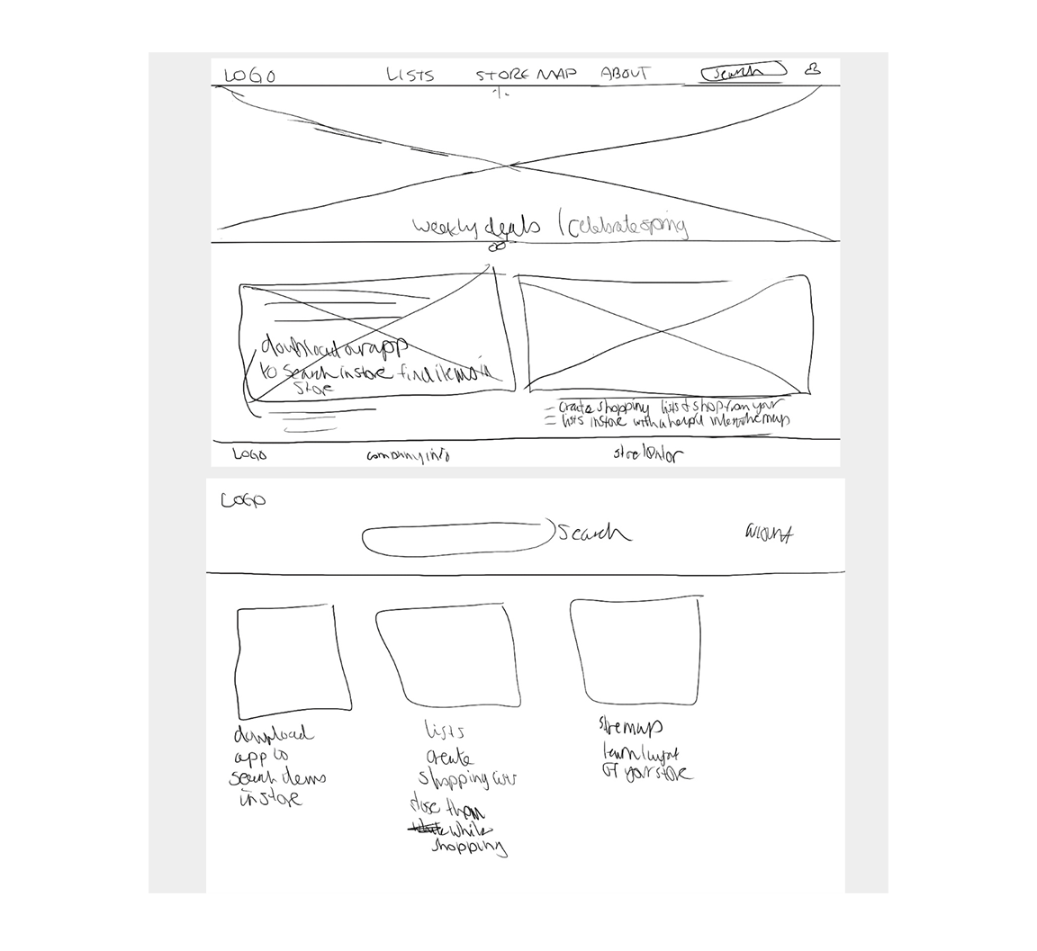
Paper wireframes
The goal was to create a simple, straightforward home page
- Search is one of the main features, so so should be prominent
- Hero image or carousel to highlight special offerings and show brand personality
- Lists and Store Map are other main features so they have their own image/text callouts as well
Paper Wireframes
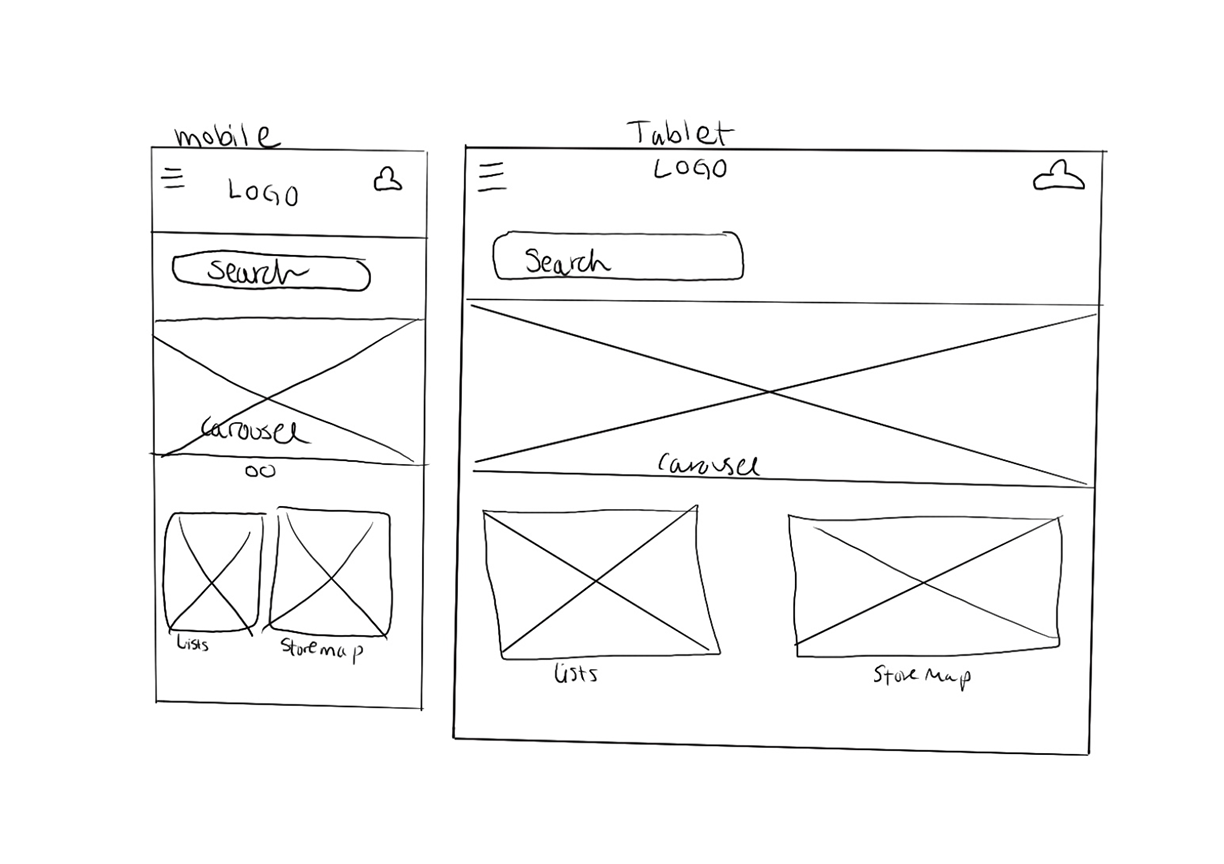
Since this is a responsive website, I sketched out mobile and tablet screen size variations.
We need to account for users who are on-the-go, using the site while at the grocery store, if they haven't downloaded the app
- hamburger menu replaces top nav
- reduce width/size of images to one and two columns
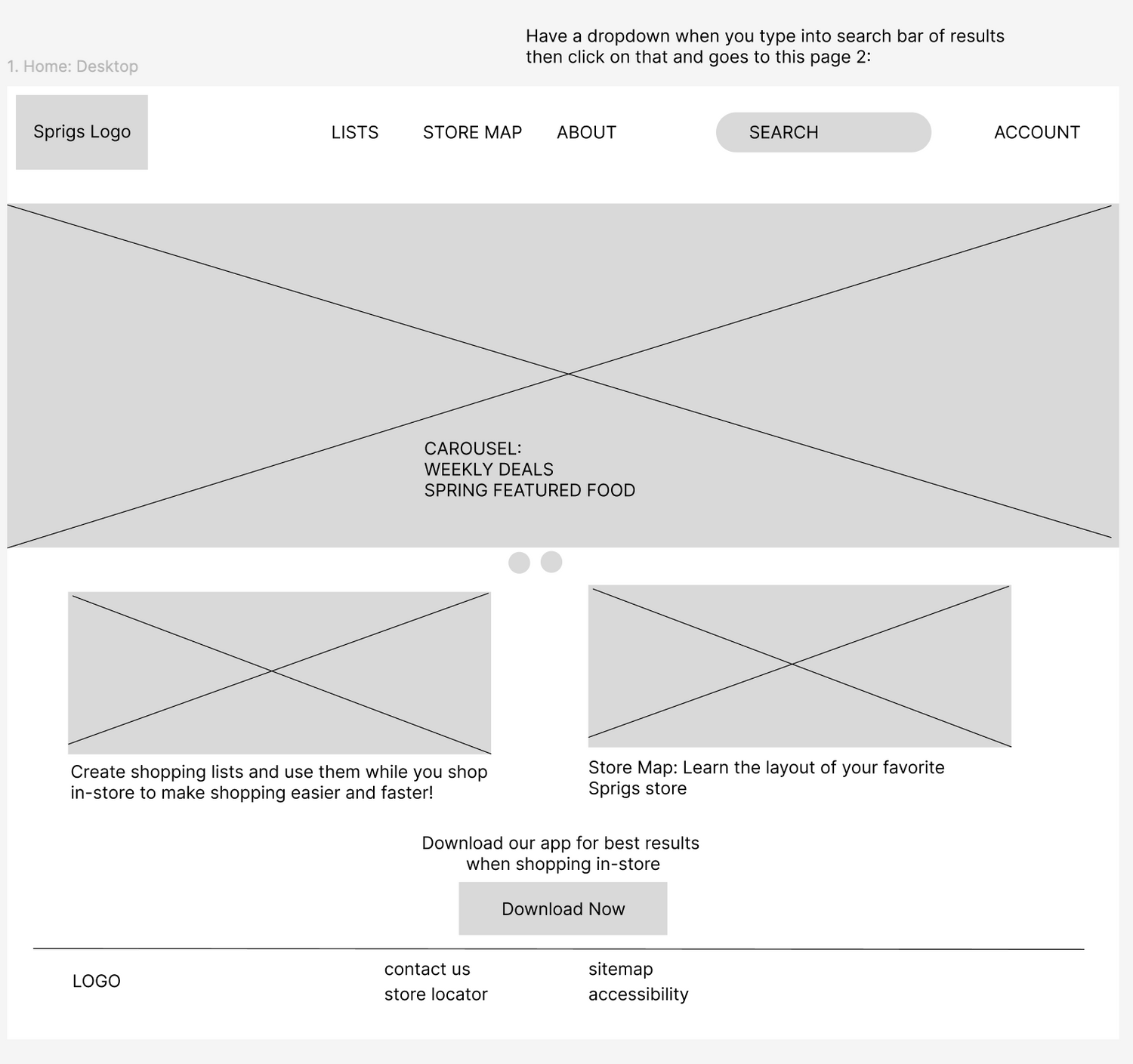
Digital Wireframes
My goal was to make the main features of the site stand out while keeping it simple:
- Search - search bar on top nav
- Lists - callout
- Store map - callout
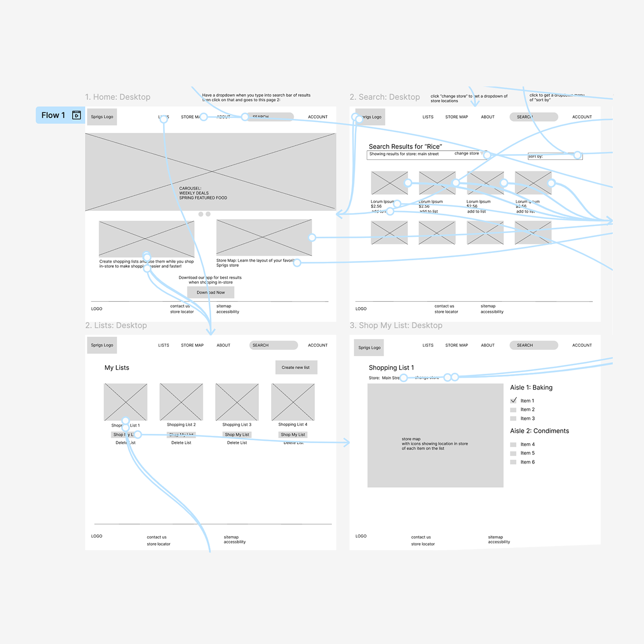
Low-Fidelity Prototype
After creating all of the mockup screens, it was time to add interactivity and more context/text to create a low-fidelity prototype. I focused on two main user flows:
Search
- search a product while grocery shopping in-store to see which aisle and where it is on a store map
Shop my List
- go to a saved shopping list and click shop my list to see list items on the store map